Your project dashboard, explained
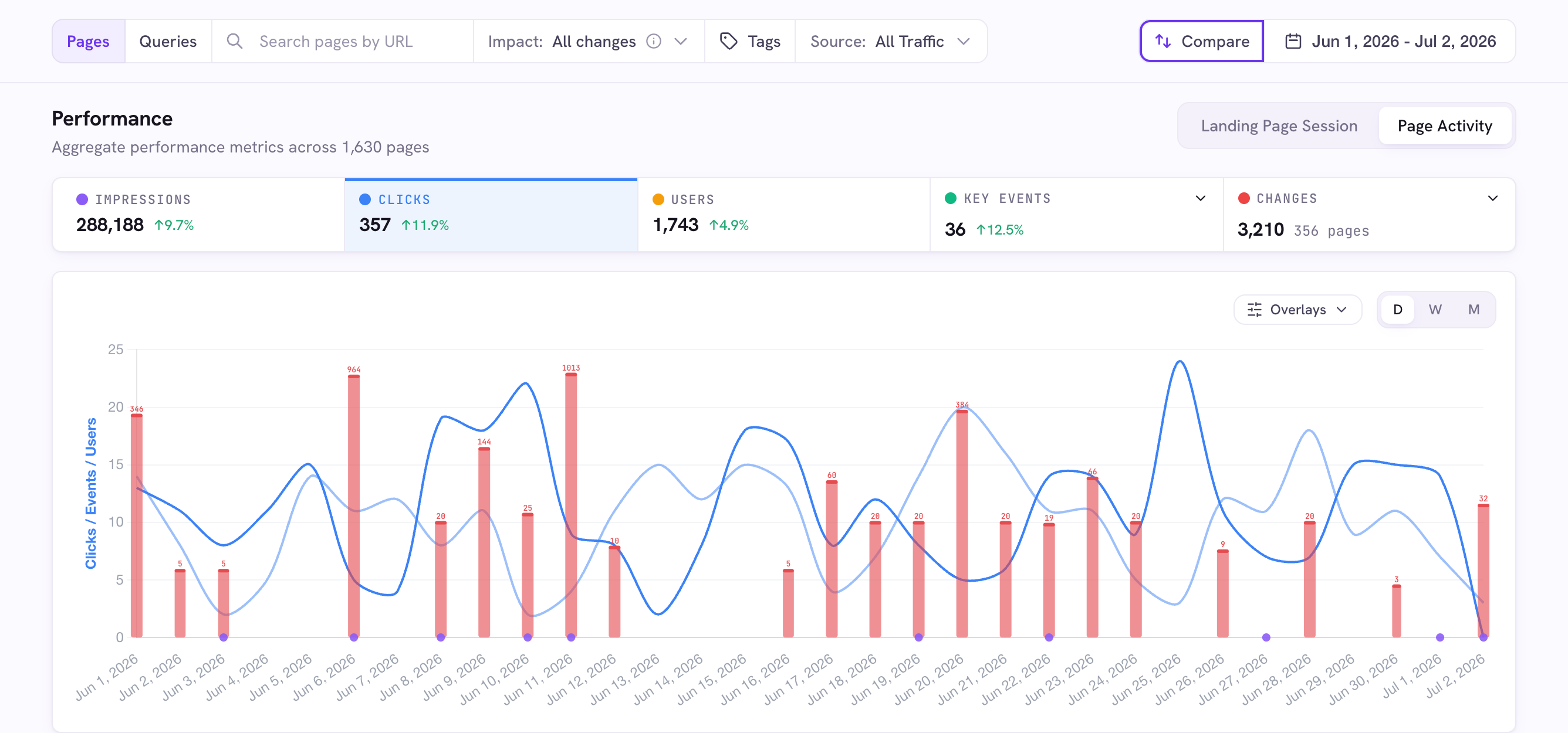
Open any project from your Projects to reach its dashboard: a filter bar, a performance chart, stat cards, and tables. Here is what each part does.
Open your dashboard
Go to your Projects and click a project. Everything below lives on that project’s page.
The filter bar
Across the top: a Pages / Queries toggle (which table shows, and what search searches), a search box, and a connected group of filters for Impact, Tags, and Source. On the right sit Compare and the date range.
Source and metrics
The Source dropdown slices traffic by All, Organic, Direct, Paid, or AI. Clicks and impressions come from Search Console (Organic only), so on Direct, Paid, or AI those are greyed out and you see Users and Key Events instead. The stat cards toggle metric lines on the chart. Click one to add or remove it.
The chart markers
On the chart, red bars mark dates with page changes, violet dots mark newly-detected pages, and green dots mark recrawls. Click a red bar to open the change-detected card.
Pages and queries tables
Below the chart, switch between Pages (with tags, changes, and traffic columns) and Queries (the search terms driving traffic). Search, sort, and tag either one.
Good to know
- Comparison is on by default. The Compare button's ring shows it is active, and hovering it reveals the exact dates.
- "Landing Page Session" counts sessions that started on a page. "Page Activity" counts interaction on it.